

ElementUI学习笔记
ElementUI简介,其安装步骤,一些布局,容器,按钮,表格,对话框的简单操作
·
目录
一、简单介绍
1、提供各种组件的UI,内容,功能现成代码
2、为了快速开发,适合用于开发管理系统端(学生信息管理系统、社区人口管理系统)UI样式
二、安装
1、下载
进入项目终端,输入:
npm i element-ui -S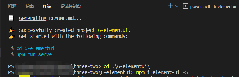
2、引入
在main.js文件中,引入element-ui
import Vue from 'vue'
import App from './App.vue'
import router from './router'
import store from './store'
import ElementUI from 'element-ui';    //引入
import 'element-ui/lib/theme-chalk/index.css';    //引入

Vue.config.productionTip = false

Vue.use(ElementUI);    //使用

new Vue({
  router,
  store,
  render: h => h(App)
}).$mount('#app')
三、布局
1、简介:通过基础的 24 分栏,迅速简便地创建布局【1行24列】
2、使用
(1)分两个12份,两个8份,效果如下
<template>
  <div class="home">
    <el-row>
      <el-col :span="12"><div class="grid-content bg-purple"></div></el-col>
      <el-col :span="12"
        ><div class="grid-content bg-purple-light"></div
      ></el-col>
    </el-row>
    <el-row>
  <el-col :span="8"><div class="grid-content bg-purple"></div></el-col>
  <el-col :span="8"><div class="grid-content bg-purple-light"></div></el-col>
</el-row>
  </div>
</template>

<script>
// @ is an alias to /src

export default {
  name: "HomeView",
  components: {},
};
</script>

<style lang="scss" scoped>
 .grid-content {
    border-radius: 4px;
    min-height: 36px;
  }
  .bg-purple {
    background: #d3dce6;
  }
  .bg-purple-light {
    background: #e5e9f2;
  }
</style>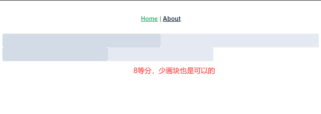
(2)自定义效果
给每行加上margin: 20px;
<template>
<div class="home">
<el-row>
<el-col :span="12"><div class="grid-content bg-purple"></div></el-col>
<el-col :span="12"
><div class="grid-content bg-purple-light"></div
></el-col>
</el-row>
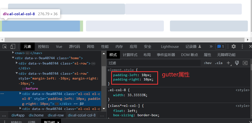
<el-row :gutter="20">
<el-col :span="8"><div class="grid-content bg-purple"></div></el-col>
<el-col :span="8"
><div class="grid-content bg-purple-light"></div
></el-col>
<el-col :span="8"><div class="grid-content bg-purple"></div></el-col>
</el-row>
</div>
</template>
<script>
// @ is an alias to /src
export default {
name: "HomeView",
components: {},
};
</script>
<style lang="scss" scoped>
.grid-content {
border-radius: 4px;
min-height: 36px;
}
.bg-purple {
background: #d3dce6;
}
.bg-purple-light {
background: #e5e9f2;
}
.el-row {// 注意观察文档,确定好选择器,这里是.el-row而不是el-row
margin: 20px;
}
</style>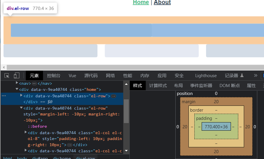
第二行加上属性gutter: 20,会自动给该行加padding-left和padding-right各10px
3、好处:响应式,根据网页的大小自动调整容器大小
四、布局容器
1、常见排布:头部、侧边、中间栏、底部
<template>
  <div class="about">
    <el-container>
  <el-header>Header</el-header>
  <el-container>
    <el-aside width="200px">Aside</el-aside>
    <el-container>
      <el-main>Main</el-main>
      <el-footer>Footer</el-footer>
    </el-container>
  </el-container>
</el-container>
  </div>
</template>

<style lang="scss" scoped>
 .el-header, .el-footer {
    background-color: #B3C0D1;
    color: #333;
    text-align: center;
    line-height: 60px;
  }

  .el-aside {
    background-color: #D3DCE6;
    color: #333;
    text-align: center;
    line-height: 200px;
  }

  .el-main {
    background-color: #E9EEF3;
    color: #333;
    text-align: center;
    line-height: 160px;
  }
</style>
2、调整样式
实现正好头部,中间,底部充满一个窗口
<template>
  <div class="about">
    <el-container>
  <el-header>Header</el-header>
  <el-container>
    <el-aside width="200px">Aside</el-aside>
    <el-container>
      <el-main>Main</el-main>
      <el-footer>Footer</el-footer>
    </el-container>
  </el-container>
</el-container>
  </div>
</template>

<style lang="scss" scoped>
 .el-header, .el-footer {
    background-color: #B3C0D1;
    color: #333;
    text-align: center;
    line-height: 60px;
  }

  .el-aside {
    background-color: #D3DCE6;
    color: #333;
    text-align: center;
    line-height: 200px;
  }

  .el-main {
    background-color: #E9EEF3;
    color: #333;
    text-align: center;
    line-height: 160px;
  }
  .el-container{//选择器包括Main,Aside,Footer
    height: calc(100vh - 60px);//calc()自动计算,100vh正好浏览器窗口大小,减去60px头部高度
  }
</style>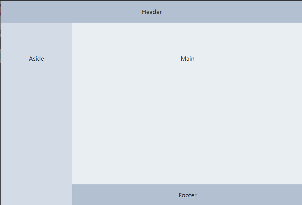
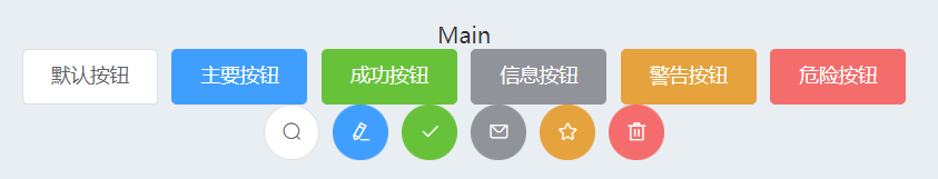
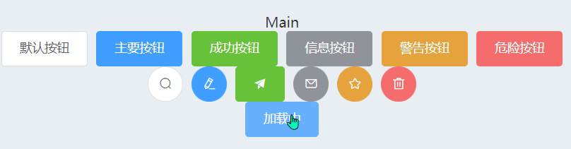
五、按钮
1、简单引用
<template>
  <div class="about">
    <el-container>
      <el-header>Header</el-header>
      <el-container>
        <el-aside width="200px">Aside</el-aside>
        <el-container>
          <el-main>
            <!-- 按钮 -->
            <el-row>
              <el-button>默认按钮</el-button>
              <el-button type="primary">主要按钮</el-button>
              <el-button type="success">成功按钮</el-button>
              <el-button type="info">信息按钮</el-button>
              <el-button type="warning">警告按钮</el-button>
              <el-button type="danger">危险按钮</el-button>
            </el-row>

            <el-row>
              <el-button icon="el-icon-search" circle></el-button>
              <el-button type="primary" icon="el-icon-edit" circle></el-button>
              <el-button type="success" icon="el-icon-check" circle></el-button>
              <el-button type="info" icon="el-icon-message" circle></el-button>
              <el-button
                type="warning"
                icon="el-icon-star-off"
                circle
              ></el-button>
              <el-button type="danger" icon="el-icon-delete" circle></el-button>
            </el-row>
          </el-main>
          <el-footer>Footer</el-footer>
        </el-container>
      </el-container>
    </el-container>
  </div>
</template>

<style lang="scss" scoped>
.el-header,
.el-footer {
  background-color: #b3c0d1;
  color: #333;
  text-align: center;
}

.el-aside {
  background-color: #d3dce6;
  color: #333;
  text-align: center;
}

.el-main {
  background-color: #e9eef3;
  color: #333;
  text-align: center;
}
.el-container {
  height: calc(100vh - 60px);
}
</style>
2、改变样式
除去圆形,换掉图标
<el-button type="success" icon="el-icon-s-promotion"></el-button>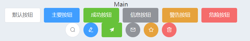
3、加载中效果
<el-button type="primary" :loading="isClick" @click="btnClick">加载中</el-button>methods:{
btnClick(){
this.isClick = true
setTimeout(()=>{
this.isClick = false
},2000)
}
},
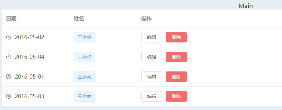
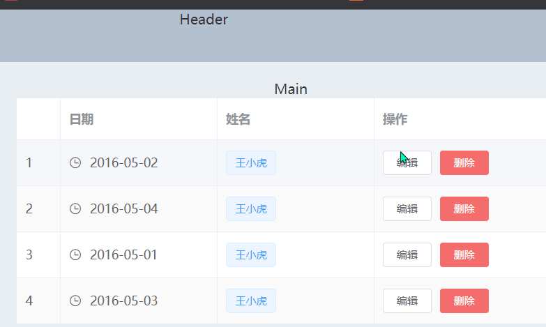
六、表格
1、简单使用
<template>
  <div class="about">
    <el-container>
      <el-header>Header</el-header>
      <el-container>
        <el-aside width="200px">Aside</el-aside>
        <el-container>
          <el-main>
            Main
            <!-- 表格 -->
            <el-table :data="tableData" style="width: 100%">
              <el-table-column label="日期" width="180">
                <template slot-scope="scope">
                  <i class="el-icon-time"></i>
                  <span style="margin-left: 10px">{{ scope.row.date }}</span>
                </template>
              </el-table-column>
              <el-table-column label="姓名" width="180">
                <template slot-scope="scope">
                  <el-popover trigger="hover" placement="top">
                    <p>姓名: {{ scope.row.name }}</p>
                    <p>住址: {{ scope.row.address }}</p>
                    <div slot="reference" class="name-wrapper">
                      <el-tag size="medium">{{ scope.row.name }}</el-tag>
                    </div>
                  </el-popover>
                </template>
              </el-table-column>
              <el-table-column label="操作">
                <template slot-scope="scope">
                  <el-button
                    size="mini"
                    @click="handleEdit(scope.$index, scope.row)"
                    >编辑</el-button
                  >
                  <el-button
                    size="mini"
                    type="danger"
                    @click="handleDelete(scope.$index, scope.row)"
                    >删除</el-button
                  >
                </template>
              </el-table-column>
            </el-table>
          </el-main>
          <el-footer>Footer</el-footer>
        </el-container>
      </el-container>
    </el-container>
  </div>
</template>

<script>
export default {
  name: "AboutView",
  components: {},
  data() {
    return {
      tableData: [{
          date: '2016-05-02',
          name: '王小虎',
          address: '上海市普陀区金沙江路 1518 弄'
        }, {
          date: '2016-05-04',
          name: '王小虎',
          address: '上海市普陀区金沙江路 1517 弄'
        }, {
          date: '2016-05-01',
          name: '王小虎',
          address: '上海市普陀区金沙江路 1519 弄'
        }, {
          date: '2016-05-03',
          name: '王小虎',
          address: '上海市普陀区金沙江路 1516 弄'
        }]
    };
  },
  methods: {
    handleEdit(index, row) {
        console.log(index, row);
      },
      handleDelete(index, row) {
        console.log(index, row);
      }
  },
};
</script>

<style lang="scss" scoped>
.el-header,
.el-footer {
  background-color: #b3c0d1;
  color: #333;
  text-align: center;
}

.el-aside {
  background-color: #d3dce6;
  color: #333;
  text-align: center;
}

.el-main {
  background-color: #e9eef3;
  color: #333;
  text-align: center;
}
.el-container {
  height: calc(100vh - 60px);
}
</style>
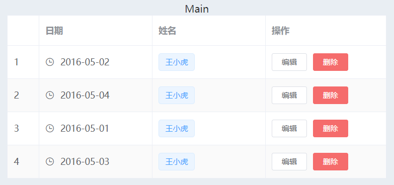
2、样式修改
给表格加上斑马纹、纵向边框、数字列
<template>
  <div class="about">
    <el-container>
      <el-header>Header</el-header>
      <el-container>
        <el-aside width="200px">Aside</el-aside>
        <el-container>
          <el-main>
            Main
            <!-- 表格 -->
            <el-table :data="tableData" style="width: 100%" border stripe> <!-- 纵向边框 斑马纹 -->
              <el-table-column type="index" width="50"> </el-table-column> <!-- 数字列 -->

              <el-table-column label="日期" width="180">
                <template slot-scope="scope">
                  <i class="el-icon-time"></i>
                  <span style="margin-left: 10px">{{ scope.row.date }}</span>
                </template>
              </el-table-column>
              <el-table-column label="姓名" width="180">
                <template slot-scope="scope">
                  <el-popover trigger="hover" placement="top">
                    <p>姓名: {{ scope.row.name }}</p>
                    <p>住址: {{ scope.row.address }}</p>
                    <div slot="reference" class="name-wrapper">
                      <el-tag size="medium">{{ scope.row.name }}</el-tag>
                    </div>
                  </el-popover>
                </template>
              </el-table-column>
              <el-table-column label="操作">
                <template slot-scope="scope">
                  <el-button
                    size="mini"
                    @click="handleEdit(scope.$index, scope.row)"
                    >编辑</el-button
                  >
                  <el-button
                    size="mini"
                    type="danger"
                    @click="handleDelete(scope.$index, scope.row)"
                    >删除</el-button
                  >
                </template>
              </el-table-column>
            </el-table>
          </el-main>
          <el-footer>Footer</el-footer>
        </el-container>
      </el-container>
    </el-container>
  </div>
</template>

<script>
export default {
  name: "AboutView",
  components: {},
  data() {
    return {
      tableData: [
        {
          date: "2016-05-02",
          name: "王小虎",
          address: "上海市普陀区金沙江路 1518 弄",
        },
        {
          date: "2016-05-04",
          name: "王小虎",
          address: "上海市普陀区金沙江路 1517 弄",
        },
        {
          date: "2016-05-01",
          name: "王小虎",
          address: "上海市普陀区金沙江路 1519 弄",
        },
        {
          date: "2016-05-03",
          name: "王小虎",
          address: "上海市普陀区金沙江路 1516 弄",
        },
      ],
    };
  },
  methods: {
    handleEdit(index, row) {
      console.log(index, row);
    },
    handleDelete(index, row) {
      console.log(index, row);
    },
  },
};
</script>

<style lang="scss" scoped>
.el-header,
.el-footer {
  background-color: #b3c0d1;
  color: #333;
  text-align: center;
}

.el-aside {
  background-color: #d3dce6;
  color: #333;
  text-align: center;
}

.el-main {
  background-color: #e9eef3;
  color: #333;
  text-align: center;
}
.el-container {
  height: calc(100vh - 60px);
}
</style>
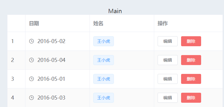
七、对话框
1、简单使用
点击表格编辑,弹出对话框
<template>
  <div class="about">
    <el-container>
      <el-header>Header</el-header>
      <el-container>
        <el-aside width="200px">Aside</el-aside>
        <el-container>
          <el-main>
            Main
            <!-- 表格 -->

            <el-table :data="tableData" style="width: 100%" border stripe>
              <el-table-column type="index" width="50"> </el-table-column>

              <el-table-column label="日期" width="180">
                <template slot-scope="scope">
                  <i class="el-icon-time"></i>
                  <span style="margin-left: 10px">{{ scope.row.date }}</span>
                </template>
              </el-table-column>
              <el-table-column label="姓名" width="180">
                <template slot-scope="scope">
                  <el-popover trigger="hover" placement="top">
                    <p>姓名: {{ scope.row.name }}</p>
                    <p>住址: {{ scope.row.address }}</p>
                    <div slot="reference" class="name-wrapper">
                      <el-tag size="medium">{{ scope.row.name }}</el-tag>
                    </div>
                  </el-popover>
                </template>
              </el-table-column>
              <el-table-column label="操作">
                <template slot-scope="scope">
                  <el-button
                    size="mini"
                    @click="handleEdit(scope.$index, scope.row)"
                    >编辑</el-button
                  >
                  <el-button
                    size="mini"
                    type="danger"
                    @click="handleDelete(scope.$index, scope.row)"
                    >删除</el-button
                  >
                </template>
              </el-table-column>
            </el-table>

            <el-dialog title="修改时间" :visible.sync="dialogFormVisible">
              <el-form
                :model="numberValidateForm"
                ref="numberValidateForm"
                label-width="100px"
                class="demo-ruleForm"
              >
                <el-form-item
                  label="时间"
                  prop="age"
                  :rules="[
                    { required: true, message: '时间不能为空' },
                    { type: 'number', message: '时间必须为数字值' },
                  ]"
                >
                  <el-input
                    v-model.number="numberValidateForm.age"
                    autocomplete="off"
                  ></el-input>
                </el-form-item>
                <el-form-item>
                  <el-button
                    type="primary"
                    @click="submitForm('numberValidateForm')"
                    >提交</el-button
                  >
                  <el-button @click="resetForm('numberValidateForm')"
                    >重置</el-button
                  >
                </el-form-item>
              </el-form>
            </el-dialog>
          </el-main>
          <el-footer>Footer</el-footer>
        </el-container>
      </el-container>
    </el-container>
  </div>
</template>

<script>
export default {
  name: "AboutView",
  components: {},
  data() {
    return {
      tableData: [
        {
          date: "2016-05-02",
          name: "王小虎",
          address: "上海市普陀区金沙江路 1518 弄",
        },
        {
          date: "2016-05-04",
          name: "王小虎",
          address: "上海市普陀区金沙江路 1517 弄",
        },
        {
          date: "2016-05-01",
          name: "王小虎",
          address: "上海市普陀区金沙江路 1519 弄",
        },
        {
          date: "2016-05-03",
          name: "王小虎",
          address: "上海市普陀区金沙江路 1516 弄",
        },
      ],
      gridData: [
        {
          date: "2016-05-02",
          name: "王小虎",
          address: "上海市普陀区金沙江路 1518 弄",
        },
        {
          date: "2016-05-04",
          name: "王小虎",
          address: "上海市普陀区金沙江路 1518 弄",
        },
        {
          date: "2016-05-01",
          name: "王小虎",
          address: "上海市普陀区金沙江路 1518 弄",
        },
        {
          date: "2016-05-03",
          name: "王小虎",
          address: "上海市普陀区金沙江路 1518 弄",
        },
      ],
      // 弹窗
      dialogTableVisible: false,
      dialogFormVisible: false,
      form: {
        name: "",
        region: "",
        date1: "",
        date2: "",
        delivery: false,
        type: [],
        resource: "",
        desc: "",
      },
      formLabelWidth: "120px",
      numberValidateForm: {
        age: "",
      },
    };
  },
  methods: {
    handleEdit(index, row) {
      console.log(index, row);
      this.dialogFormVisible = true;
    },
    handleDelete(index, row) {
      console.log(index, row);
    },
    // 表单
    submitForm(formName) {
      this.$refs[formName].validate((valid) => {
        if (valid) {
          alert("submit!");
        } else {
          console.log("error submit!!");
          return false;
        }
      });
    },
    resetForm(formName) {
      this.$refs[formName].resetFields();
    },
  },
};
</script>

<style lang="scss" scoped>
.el-header,
.el-footer {
  background-color: #b3c0d1;
  color: #333;
  text-align: center;
}

.el-aside {
  background-color: #d3dce6;
  color: #333;
  text-align: center;
}

.el-main {
  background-color: #e9eef3;
  color: #333;
  text-align: center;
}
.el-container {
  height: calc(100vh - 60px);
}
</style>
2、添加自定义内容
添加单选框到对话框中,注意标签需要添加的属性及变量存储要放在对话框中
<el-form-item label="性别" prop="radio" :rules="[{ required: true, message: '性别不能为空' }]">
  <el-radio v-model="numberValidateForm.radio" label="1"
    >男</el-radio
  >
  <el-radio v-model="numberValidateForm.radio" label="2"
    >女</el-radio
  >
</el-form-item>
numberValidateForm: {
age: "",
radio: "",//属性值绑定到对话框中
},
3、认识不同写法的区别
<el-table-column prop="name" label="姓名" width="180" />

<el-table-column label="姓名" width="180">
  <template slot-scope="scope">
    <el-popover trigger="hover" placement="top">
      <p>姓名: {{ scope.row.name }}</p>
      <p>住址: {{ scope.row.address }}</p>
      <div slot="reference" class="name-wrapper">
        <el-tag size="medium">{{ scope.row.name }}</el-tag>
      </div>
    </el-popover>
  </template>
</el-table-column>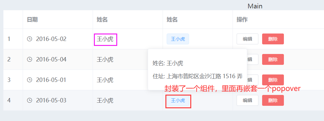
(1)popover弹出框
(2)template上的属性slot-scope="scope"是作用域插槽,关于作用域插槽详细学习,小伙伴们可以参考小编下面这篇文章Vue基础语法(五)_申小兮IU的博客-CSDN博客插槽的基础使用,具名插槽,作用域插槽,子组件向父组件通信总结https://blog.csdn.net/qq_51478745/article/details/127650324

基于 Vue 的企业级 UI 组件库和中后台系统解决方案,为数万开发者服务。
更多推荐
 1
1 0
0- 0


 已为社区贡献1条内容

所有评论(0)